Make your button look like an actual button

A simple guide to creating buttons that feel interactive, using nothing but modern CSS techniques inspired by real-world materials and lighting.
In recent months, I noticed sites like Clerk and Personio adopting a new (some say old) button style that feels more realistic and interactive.
I find this approach refreshing and show how you can create similar buttons using modern CSS techniques.
#The "problem" with flat buttons
Flat buttons are common in modern web design, but they can sometimes feel - well, flat. They often don’t look or feel like real buttons and can miss the depth that makes an interface feel more realistic and engaging.
Let's look at a simple example of a flat button with a solid color.
<button
  class="rounded-md border border-neutral-600 bg-neutral-900 px-3
    py-1.5 text-sm text-neutral-100 hover:bg-neutral-800">
  Flat Button
</button>The code for both the plain CSS and the Tailwind CSS versions of the finished button is available at the end of this post.
#Take lighting into account
Light interacts with surfaces in the real world, creating highlights and shadows that give objects a three-dimensional look.
For example, if you look down at your keyboard (phone users, use your imagination), you’ll notice that the keys aren’t just flat surfaces. They have a slight inner shadow and gradient that gives them depth.
We can use the same principle to create a more realistic button. Light typically comes from above, so the top of the button should be brighter, while the sides and bottom are darker.
<button
  class="rounded-md ... relative before:absolute
    before:inset-0 before:bg-linear-to-b before:from-white/20
    before:to-transparent">
  With Gradient
</button>I'm using a before pseudo-element to create the gradient effect.
This allows me to keep the simple hover effect with a solid color without
needing to update the gradient on hover and active states.
#Border colors and shadows
If you paid close attention to the previous examples, you might have noticed that the button has a subtle border that's slightly lighter than the background. That’s how I would typically style a flat button.
But if we return to our keyboard example, you'll see that the keys usually have a darker border. That’s because they’re raised, and there’s a small gap between the key and the surface beneath, where light doesn't reach easily.
So let's darken the border and add a subtle shadow to give the button a bit of elevation, as it would have in the real world.
<button
  class="rounded-md ... border-neutral-900 shadow-md">
  Darker Border With Shadow
</button>These changes are subtle, but they make a noticeable difference in the end.
#Make the button stand out
When we talk about pressing a button, it usually implies that the button sticks out slightly and can be pushed in.
We already talked about lighting coming from above. That also means the top of the raised part should be lighter than the rest of the button.
We can apply a simple trick using an inset shadow with no blur to simulate this depth. Let’s add this inset shadow to the top of the button.
<button
  class="rounded-md ... inset-shadow-2xs inset-shadow-neutral-700">
  With Inset Shadow
</button>#The icing on the cake
As you may have noticed, the buttons here aren’t images but real HTML elements you can interact with. If you clicked one, you probably saw that aside from the background color changing on hover, nothing happens when it’s pressed.
We can improve this by styling the button’s active state. To make it look like the button is being pressed down, we can darken the background, remove the outer shadow, and blend the inset shadow with the background.
<button
  class="rounded-md ... active:bg-neutral-950 active:shadow-none
    active:inset-shadow-neutral-800">
  Active State
</button>That looks much better, but there are two subtle enhancements we can still make.
First, we can change the cursor to a pointer to indicate the button is clickable.
There’s a long debate about whether to use a pointer cursor or not, but I think most people expect it - and in my opinion, it makes the button feel more interactive.
Second, we can add a slight transition to make hover and active states feel smoother.
<button class="rounded-md ... cursor-pointer transition-all">
  After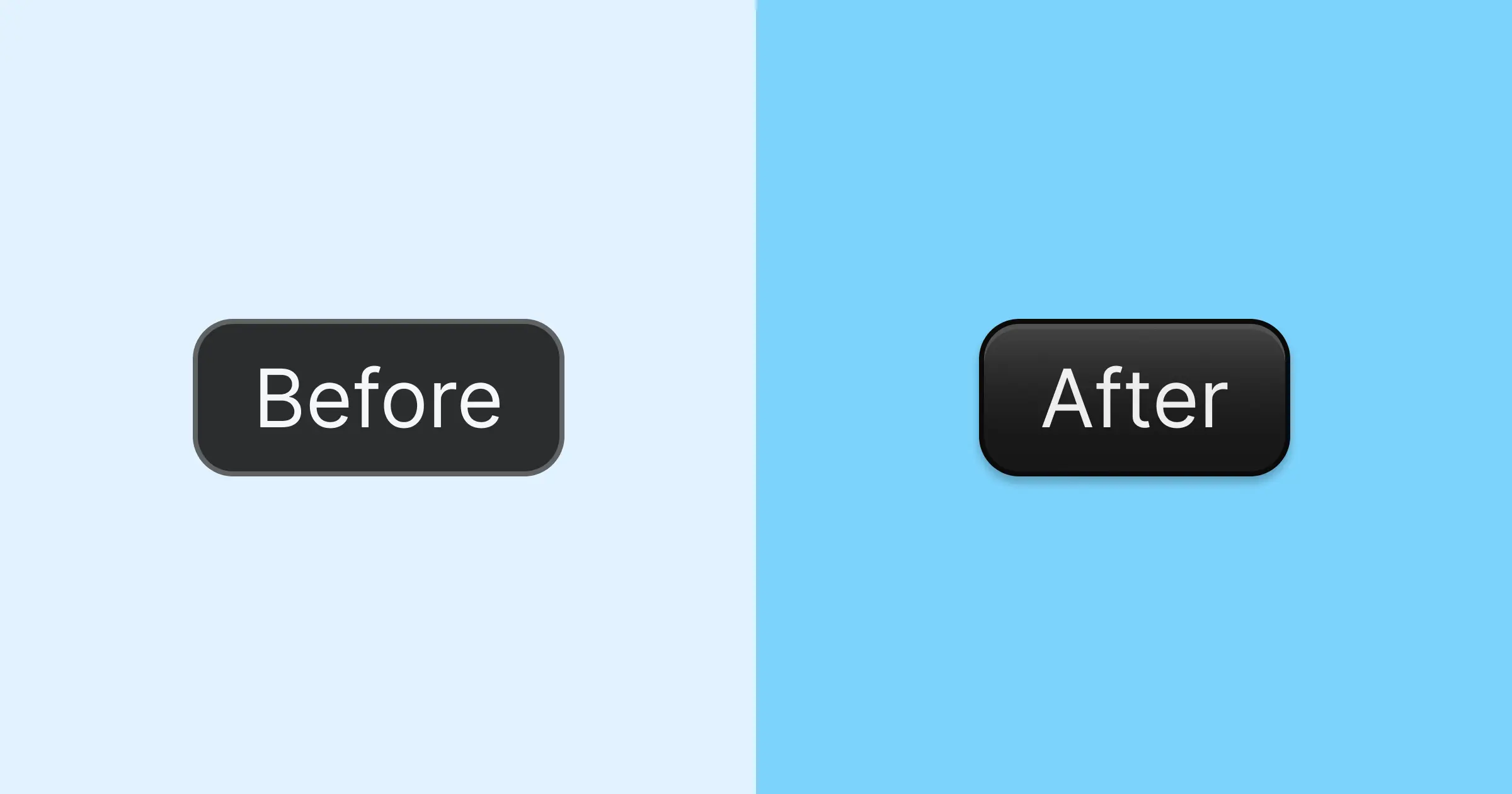
</button>#Final result
Here’s a comparison between the flat button and the enhanced version.
I’m not saying one is better - that also depends on your design choices. But I think it's safe to say, that the second button looks more realistic.
<button
  class="relative cursor-pointer overflow-hidden rounded-md border
    border-neutral-950 bg-neutral-900 px-3 py-1.5 text-neutral-100
    shadow-md inset-shadow-2xs inset-shadow-neutral-600 transition-all
    before:absolute before:inset-0 before:bg-linear-to-b
    before:from-white/20 before:to-transparent hover:bg-neutral-800
    active:bg-neutral-950 active:shadow-none
    active:inset-shadow-neutral-800">
  After
</button>Or if you prefer plain CSS:
button {
  position: relative;
  cursor: pointer;
  overflow: hidden;
  border-radius: 0.375rem;
  border: 1px solid #0a0a0a;
  background-color: #171717;
  padding: 6px 12px;
  color: #f5f5f5;
  box-shadow:
    inset 0 1px #525252,
    0 4px 6px -1px rgb(0 0 0 / 0.1),
    0 2px 4px -2px rgb(0 0 0 / 0.1);
  transition: all 150ms cubic-bezier(0.4, 0, 0.2, 1);
}
button::before {
  content: "";
  position: absolute;
  inset: 0;
  background: linear-gradient(to bottom, rgba(255, 255, 255, 0.2), transparent);
}
button:hover {
  background-color: #262626;
}
button:active {
  background-color: #0a0a0a;
  box-shadow:
    inset 0 1px #262626,
    0 0 #0000;
}#Where to go from here
For a real-world application, you might want to consider adding some additional features, such as:
- Focus styles: Ensure the button is accessible by adding focus styles for keyboard navigation.
- Disabled state: Style the button when it’s disabled to indicate it’s not interactive.
- Loading state: If the button triggers an action that takes time, consider adding a loading spinner or changing the button text to indicate that the action is in progress.
A good starting point for these enhancements is Shadcn’s Button component which provides a solid foundation for building buttons if you are using Tailwind CSS and React.